While most were focusing on the latest watches of the show, Michael and I diverted our attention to the communication of brands' design language through other media..
For what’s probably Baselworld’s last March show, I was joined by Geckota’s graphic designer, typographer, printer and clothing entrepreneur ambassador Michael Langley. It was his first Baselworld and first time in Switzerland. What aspects of visual design intrigued the founder of Uchi Clothing and the Uchi Horology Collection?

Luzern, Switzerland - Image Credit: Al Hidden
Travelling to Basel, with watches and Swiss design on our minds, I’d contemplated ؘthe Swiss graphic icons depicted in Christian Brändle’s 100 Years of Swiss Graphic Design – arguably one of the best references on Swiss-style (aka The International Style) with its characteristic bold use of white space, minimal type (often – but not exclusively – sans serif) and pioneering graphic grids.
Though I sought contemporary examples of this design, Michael explained their paucity. With Switzerland so influential in global graphic design, what we saw, while drawing on the heritage of pioneers such as Josef Müller-Brockmann and Richard Paul Lohse, is essentially the same good design as anywhere else in the world. At Luzern station – even allowing for cigarette advertising’s decline – I saw no obvious legacy of Müller-Brockmann’s influential 1950s Turmac platform-end banner ads overhead. Or, for that matter, 2018’s towering Breitling posters.
So what would Baselworld offer?

In the heart of Hall 1, Michael Langley and me - Image Credit: WatchGecko Online Magazine
An international visual style
On entering Baselworld’s hallowed halls, our initial impression was of an equally international visual style rather than anything overtly ‘Swiss’. I’d long anticipated Michael’s impressions as a Baselworld first-timer. Now, from giant pavilions to Riskers’ clever use of Montserrat, I was curious what would catch his eye.

Baselworld Hall 1 and specifically Zenith and Tag Heuer - Image Credit: Michael Langley
For some reason, beside TAG Heuer’s ‘Don’t Crack Under Pressure’ stand, I was thinking about the railway-track graffiti of Basel’s approaches – and Michael’s interpretation as a hip-hop and graffiti art expert. ‘The visual style,’ he’d explained, ‘is pretty much what you’d find in West London’s railway yards or New York’s A-line – only subtle local nuances seem uniquely Swiss. Maybe there’s more block-lettering, but whether it reflects Swiss design’s influence or artists’ unimaginativeness, isn’t clear. The only certainty is that such Bauhaus-inspired lettering is consistent with the Swiss style that drew on Bauhaus, de Stijl, Constructivism and The New Typography.’
To me, uneducated in hip-hop and ‘tagging’, the spray-painted railway architecture looked like all the other railway graffiti I’d seen proliferate in Switzerland since 1980. Something else that hasn’t changed much over decades is the appeal of Tag Heuer’s Autavia – an unarguable brand icon. Since 2017, it’s had a renaissance with the Rindt Autavia and this year’s 42mm watches. Like so many commentators, I love that rounded ‘first-gen’ case, bevelled (‘so 1960s’) lugs, bi-directional bezel and aviator-friendly crown.
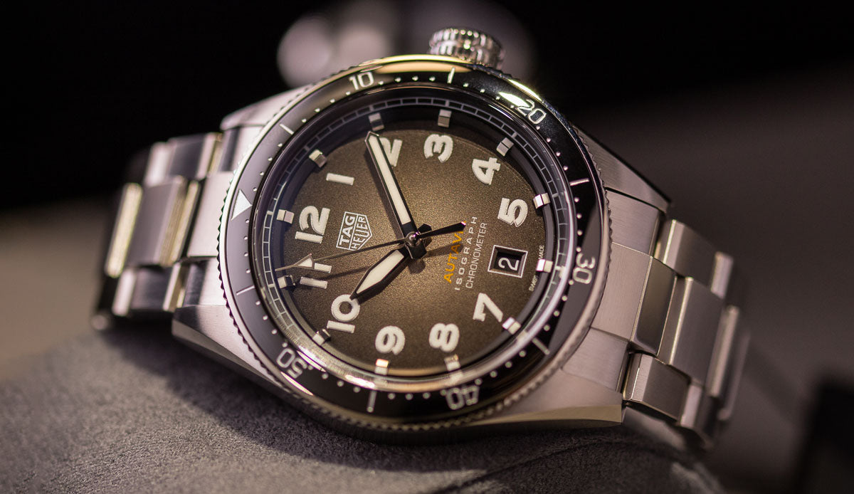
The New 2019 Tag Heuer Autavia - Image credit: WatchGecko Online Magazine
Monolithic pavilions
Essentially, Rolex re-presented their 2018 pavilion. On reflection, this year’s novelty, the white-gold Yachtmaster 42, is growing on me – although, at the show, Michael and I preferred the established Yachtmaster 40.
‘Although not a brand I identify with, or aspire to,’ says Langley, ‘I like how Rolex adds another dimension to a big, brand-focused pavilion with a subtle wave motif. Initially, I considered the pavilion boring and predictable. Actually, it contrasts well with more heavily visual pavilions – and Chanel’s instantly-recognisable monochrome branding. When you’re Rolex, I guess your name says everything. Given that, and how easy it would be to continue the simple monolithic theme with understated display windows, I was pleasantly surprised by their three-dimensional moulded woodcut animal backdrops. And how, despite beautiful execution, they never upstaged the watches. I’m no Rolex fan, but the balanced subtlety and impact impressed me.’

The Rolex booth Baselworld 2019 - Image Credit: Michael Langley
Meanwhile, at Post-Lagerfeld Chanel, stark simplicity is taken to the limit. The stand of this fast-growing luxury brand carries little adornment beyond its instantly-recognisable logotype. ‘That’s just Chanel for you;’ says Michael, ‘the signature “less is more” branding and wordmark are so closely associated with it that recognition’s guaranteed. Along with Rolex, this is probably Baselworld’s most instantly-recognisable brand.’

The Chanel booth at Baselworld 2019 - Image Credit: Michael Langley
Across the aisle, Hublot’s ‘big-video’ approach sits alongside Zenith and Breitling with its emphasis on moving images. Why does Hublot look how it does? ‘Compared to, say, Rolex, it’s more of a fashion statement,’ says Langley. ‘Although it’s a very high-end one with a solid horological basis that’s evolved fast and earned real credibility since 1980. That’s Hublot in a nutshell.’

The Hublot Big Bang Unico Sang Bleu II Titanium - Image Credit: Hublot Press
Typography, Bell & Ross
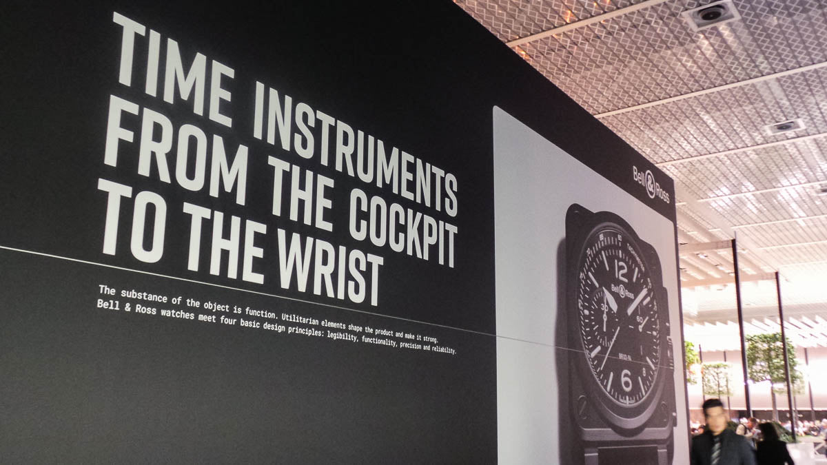
The Bell & Ross Baselworld booth - Image Credit: Michael Langley
In Europa Star, I enjoyed Pierre Grosjean’s apposite article on (mis)use of typography by Swiss watchmakers. As so many fail to harness Switzerland’s renowned typographic expertise, the article suggests that their failings only highlight those who do. Mondaine gets special mention, as well as Ventura’s relationship with late Swiss typographer Adrian Frutiger. Grosjean also singles out German brands such as Junghans (Max Bill’s 1961-designed dial) and Nomos Glasshütte, and quotes journalist Timm Delfs who says they’ve ‘been particularly clever in their decision to work with designers trained in typography.’

The Bell and Ross BR V3-94 R.S.19 - Image Credit: Bell & Ross Press
At Bell & Ross, we particularly admired the BR03-92 BI-COMPASS, BR V2-94 R.S.18 and BR V2-94 Bellytanker. Michael comments on the brand’s combination of type, static instrumentation imagery, a wall-height watch and white-out-of-black text. ‘Visually, the stand sits between Rolex and Chanel, and Hublot and Zenith’s multimedia. Contrary to widespread belief, white reversed-out text can work if the scale’s right.’ On B&R’s use of typography as a design element, he says: I think Bell & Ross deserve credit.’
Patek Philippe

The Patek Philippe booth Baselworld 2019 - Image credit: Michael Langley
I’ve previously commented on Patek Philippe’s approachability compared to, say, Rolex or Bulgari (‘I love the serpentine stand with its foot-level explanatory marquee, but the entrance feels like an unwelcoming nightclub door with too many doormen’ says Langley).
As usual, the main wristwatch collections adorned the outer sides of a stand that Michael characterised as ‘ultra-luxury department store’. After the 5212A Calatrava Weekly Calendar, his attention fell on the Japanese Prints, Old Geneva and Steam Engine – ‘they could do with white hands against a dial that doesn’t have any white content’ – collections.

The new for 2019 Baselworld press area looks to impress - Image Credit: Al Hidden Copywriter
‘What really impressed,’ he enthused as we headed for refreshments in the press centre, ‘is how they’ve executed that “box-in-a-box-in-a-box” stand design. It’s done very well.’
Unsurprisingly, while Wasserman & Company were serving food, a queue formed. This allowed us to appreciate the centre’s suspended lighting – whether accidental or intentional, the watch bezel imagery was very apt.
The Baselworld Messeplatz 2019 - Image Credit: WatchGecko Online Magazine
Later, after a break under the Messeplatz’s Herzog & de Meuron-designed ‘doughnut’, and still seeking true Swiss graphic style, we visited the Newscorner. ‘There you are,’ said Michael, holding The New York Times style magazine On The Edge. ‘Of all the international magazines here, its cover design – especially the bold structural typography – probably demonstrates Swiss graphic style better than any.’

On The Edge Magazine - Image Credit: Al Hidden
Riskers
Tim Vaux has already described well this ‘must watch’ startup with its refreshingly distinctive pen-and-ink graphics of a WW1 soldier, entrepreneur and contemporary adventurer that we met up on the mezzanine Incubator section.
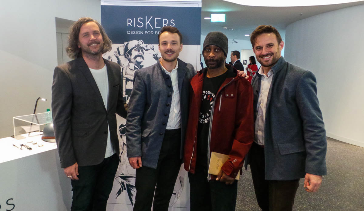
Michael with the guys from Riskers at Baselworld - Image Credit: Michael Langley
Now, here are a couple more observations on the ex-Richemont team’s vision for those who step forward from their comfort zone like the advancing ‘K’ in Riskers’ logo. Incidentally, Julieta Ulanovsky’s Montserrat typeface beautifully captures the character of urban typography from Buenos Aires’ Montserrat neighbourhood in the early-twentieth-century – just as pocket watches were evolving into wristwatches.

The Riskers Stand At Baselworld 2019 - Image Credit: Riskers Press
Riskers Pierre Guerrier said: ‘We’re inspired by ordinary men from the past who faced challenges together and responded by transforming themselves and their watches.’
Starting with people, not watches, and bringing this idea up to date promises an interesting brand and matching design innovation. Trust us, designer Malo le Bot (ex Vacheron Constantin and Baume & Mercier) is very skilfully bringing the pocket watch’s evolution to wristwatch into our century.
Perceptively, Michael noted an absence of watches on Riskers’ personas. ‘Unlike any other brand I saw, they’re cleverly attaching watches to people rather than trying to attach people to a watch and brand. They appear to be the only ones genuinely looking to reverse the status quo and celebrate individuals. Other brands claim to, but Riskers are actually doing so.’
Swiss style and Breitling

‘Since the 1950s,’ Michael explains at Breitling’s stand, ‘Swiss influence has been so influential on all good design that it’s often hard to categorise particular examples of good modern graphics as “Swiss design”.’
After its formative pre-war years, Swiss graphic design emerged from the bubble of WW2 neutrality to deliver timely, unprecedented, communication clarity. ‘Before movements such as Bauhaus, which influenced Swiss style,’ says Michael, ‘most graphic design was “newsprint-type”. Then Swiss design minimised and shaped information into revolutionary visual communication that influenced “good design” worldwide – and graphic designers’ evolution into communicators rather than just artists.
Significantly, type’s radical new juxtaposition to white space meant designers could control and integrate design, create visual balance and focus emotion as never before. We take it for granted in modern design, but it was revolutionary.’

Breitling’s Navitimer 1 B01 Chronograph 43 Swissair Edition - Image Credit: WatchGecko Online Magazine
If one watch at Baselworld shares Swiss style’s magic, it’s surely Breitling’s Navitimer 1 B01 Chronograph 43 Swissair Edition. What particularly resonated was how the Swissair colours and logo seemed to represent the most visible Swiss style icons I’d seen in Switzerland such as Mueller-Brockman + Co’s ‘cross and arrows’ on the SBB’s Pininfarina-designed locomotives and Hans Hilfiker’s iconic railway clock with signature red-ladle second hand and stop2go pause that, with the Helvetica typeface, defines Mondaine’s visual identity.

The iconic Swiss railway clock - Image Credit: Al Hidden
Of course, Swissair, despite being one of the first airlines with a solid corporate identity – an identity combining strong national influences with elements of American advertising – is no more. The same goes for Pan-Am and TWA, the collection’s other airlines – as well as many of the world’s split-flap airport information displays that inspired Breitling’s window displays.

As always, the windows of Baselworld remain unchanged - Image Credit: Al Hidden
Along with visual icons such as SBB’s corporate identity, Otto Baumberger’s posters and Die Mobiliar’s witty ‘Schadenskizze’ ads, Karl Gerstner’s 1981 Swissair identity – with its sans serif Futura typeface – is another Swiss style paragon. What a joy to see it celebrated on the exhibition case back of a watch that, as someone once described Swissair’s identity, is so ‘polyglot, cosmopolitan and downright “awfully international” ‘.
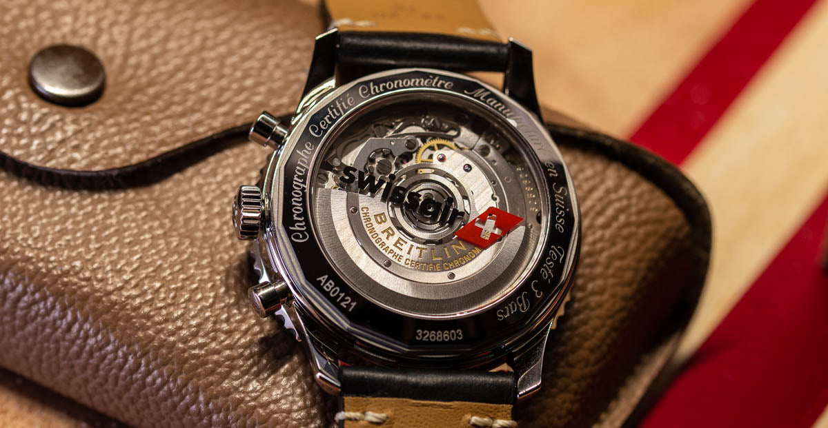
Breitling’s Navitimer 1 B01 Chronograph 43 Swissair Edition Caseback - Image Credit: WatchGecko Online Magazine
Moving upstairs
‘Downstairs, brand is paramount. Although brands are important in Hall 1.1, I feel it’s more about the watches themselves’ says Michael. Meanwhile, I’m distracted by the hall ceiling’s exposed pipework. I recall Rogers and Piano’s Centre Georges Pompidou (1977) – and its connection with classic Swiss style via Visual Design Association (VDA) / Jean Widmer, Hiestand & Associés’ acclaimed visual identity. Oh, how today’s naked hall architecture differs from the tiny booths and suspended chandeliers of the original Schweizer Mustermesse Basel (MUBA).

The bare look upstairs at Baselworld 2019 - Image Credit: Al Hidden
Divers? Really?
This year’s Baselworld saw diving meet Nomos Glasshütte’s Bauhaus-inspired simplicity during the Bauhaus centenary year – with the launch of 1000-foot-rated Club Sport and Tangente Sport Neomatic timepieces.

I like both, but despite commentators bestowing the ‘divers watch’ appellation, without screw-down crowns, unidirectional bezels or a crown guard (Club Sport), how these really be considered serious ‘divers’?
Celebrating ‘Tante Ju’ and Seiko’s lion
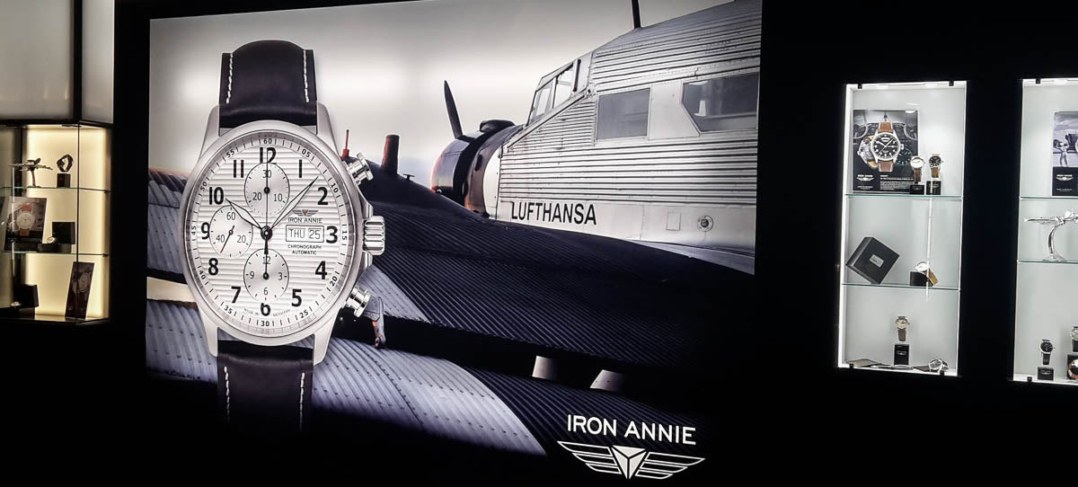
The Iron Annie booth at Baselworld 2019 - Image Credit: Al Hidden
As a copywriter, product names fascinate me. So it was interesting to meet Pointtec’s Hans Brandt and learn how changing Junkers to Iron Annie was prompted by not relicensing Junkers' name – and its perceived negative connotations in North America. I love how the corrugated duralumin of the iconic Ju-52 ‘Tante Ju’ echoes so distinctively in the brand’s visual style. Just look at their Valjoux 7753-powered 6618-1 chronograph.

Nearby, Citizen repeated last year’s amazing installation-space display of 70,000 hanging watch main plates – supported by impressive performances, on a Sleeping Beauty motif, by Nagano-born dance artiste Aoi Yamada. And at Grand Seiko, celebrating 20 years of Spring Drive, we loved the new limited edition Sport Collection. In particular, the visual elements (including ‘lion’s claw’ lugs and ‘lion’s mane’ dial) inspired by the brand’s signature animal.
Fauxtina – LACO-style

The Laco Erbstück Range now in 39mm - Image Credit: WatchGecko Online Magazine
I’ve long admired LACO’s watches and heritage. But I again found myself torn by their Erbstuck (heirloom) concept. Sure, while comparing originals and 2019’s pieces, we appreciated the design and workmanship. But stunningly executed though each watch is, if I can’t wear a 1940s original, it still seems more authentic to let time and my ownership put its unique mark on a contemporary watch.
Is there anything new under the sun?

The Tag Heuer Connected Modular Golf Edition - Image Credit: Tag Heuer Press
During another break, Michael waxes lyrical on the watch scene and how, even as brands embrace connected watches, long-established visual norms seem hard to let go. WatchPro recently reported Swatch Group’s legal action against Samsung, based on allegations that ‘downloadable smartwatch faces “bear identical or virtually identical marks,” to the trademarks it owns and uses on its watches.’ Whatever the outcome, this speaks volumes about how, even for companies without conventional watchmaking track-records, design often means just more of the same.
Michael says: ‘This just makes exceptions to watch conventions, such as Hamilton’s Ventura Elvis watch, stand out and shows how refreshing genuine visual difference is.’
Langley’s favourite stand

The Zenith booth at Baselworld 2019 - Image Credit: Michael Langley
Back downstairs with Zenith, Michael shared the WatchGecko team’s excitement over skeletonised timepieces such as the Defy Inventor. The stand’s variety of visual elements also caught his eye. There were just so many engaging visual ingredients, including Zenith’s brand logotype, ‘50 Years of El Primero’ visual, the front-upper video wall and an abstract movement image.
Then there was the interesting horizontally-split front wall to contrast with TAG Heuer’s. Best of all, I thought, was how they used hundreds of COSC certificates as art; that was genius. And then there were their window displays where, for some reason, the ‘Great Secret’ aircraft evoked Ruedi Baer et Associés definitely-Swiss-style visual identity for Cologne-Bonn Airport – and its SimpleKölnBonn font.

COSC Certificates at the Zenith booth Baselworld 2019 - Image Credit: Michael Langley
What, no Swatch?
In the year Baselworld re-arranged itself around the absence of Swatch Group, it was interesting to be looking at icons of Swiss graphic design. At Bivi’s booth, Michael’s exclaimed, ‘It’s the next best thing to having classic Swatch watches here,’ as he viewed their Pop-Art graphics and multi-coloured product. I could see what he meant, and how those bright colours hinted at 1983’s classic Robert & Durrer/Käti Robert-Durrer, Jean Robert Swatch designs.

Swatch Group couldn't stay away from Basel completely this year... - Image Credit: Al Hidden
And though Hamilton’s plane wasn’t hanging in Basel station, Swatch Group ensured a good showing with its TISSOT Touch hoardings. Their no-show may have been a talking point before Baselworld 2019, but even in their absence they still got in on the show…
Eight to bring home

Porsche Design 1919 Globetimer UTC - Image Credit: Porsche Design Press
With our time at Baselworld ending, we swapped notes on which watches we’d love to bring home. For me, it was Breitling’s Swissair Navitimer, Porsche Design’s 1919 Globetimer UTC, a black-dial Grand Seiko 20th Anniversary Spring Drive, Iron Annie’s 6618-1 Chronograph, Bell & Ross’s BR V2-94 R.S.18, TAG Heuer’s new Autavia and Zenith’s Chronomaster 21 El Primero. Oh, and Breitling’s Navitimer 8 B35 Automatic Unitime 43 that so impressed me last year and still does...

The New Zenith Defy Inventor 2019 - Image credit: WatchGecko Online Magazine
For Michael, it’s Bulgari’s Octo Finissimo Automatic titanium, Patek Philippe’s 5212A Calatrava Weekly Calendar, Zenith’s Defy Inventor, a brown or silver-grey dial Rolex Yachtmaster 40, Grand Seiko’s slimline Elegance piece with red urushi dial and their Chronograph GMT Spring Drive. Finally, the Bell and Ross BR 03-92 BI-COMPASS and Oris’s red-dialled bronze Big-Crown Pointer Date.
Brochures and beer
At our hotel one evening, I bought Michael an Eichhof, presented him with brochures from six brands and sought his professional opinion. Our two-hour conversation could support an article in itself, but here are its highlights.

A range brochures from the top brands at Baselworld - Image Credit: Al Hidden
‘Porsche Design and Patek Philippe,’ he opined, ‘deliver masterclasses of on-brand product literature and exquisitely understated brochure design. Tudor’s approach is youthful, uses people well, and nice contemporary “magazine style” layouts with “cut-into” images.’
Next, he described Zenith’s book as ‘noticeably functional and very confident’. Breitling’s latest Chronolog is ‘a comprehensive catalogue that does exactly what it’s supposed to do. It’s very functional, very historically orientated and easy to use.'
Then there’s The Collection from Oris. In Michael’s words, ‘a superb reference book, a definite “keeper” that cleverly combines many different visual and informational styles.’ Ultimately, it got his vote as the book that most ably handled diverse graphic styles and a wealth of differing information. ‘As a typographer, I can see what a challenge it will have been. As a graphic designer, I’d be very proud with it in my portfolio.’
Final thoughts
Looking beyond the watches themselves, visual design at Baselworld, as Michael kept reminding me, ‘is actually the same rather safe, predictable, mix of international visual style that you’d find at any major international trade show.’
However, look hard and nearly all visual design is there in some form, from big, predictable stands to traces of classic Swiss style. Equally, in Grand Seiko’s zaratsu-polishing, or Paul Lannier’s Catalan-inspired creations, there’s engaging visual design from further afield. And of course, despite his studied underwhelm, Michael actually loved the design displayed by the world’s most amazing watches.

Romain Gauthier Insight Micro-Rotor White Gold 2019 - Image Credit: WatchGecko Online Magazine
Among Baselworld’s stands, we saw what’s possible with type, stand design, multimedia and millions of Swiss francs. And simple booths from brands like LACO that need little more than unique heritage to appeal. ‘Of everything,’ says Michael, ‘I’d most like to have Zenith’s stand in my CV.’
However, as we boarded the green Trämli to Basel Hauptbahnhof for the last time and left behind the multi-million-dollar pavilions housing the world’s most exquisite timepieces, one nascent brand was all we could talk about. It was Riskers, with only a brilliant vision, 10 of watchmaking’s best brains and that distinctive forward-standing ‘K’ in its logo.